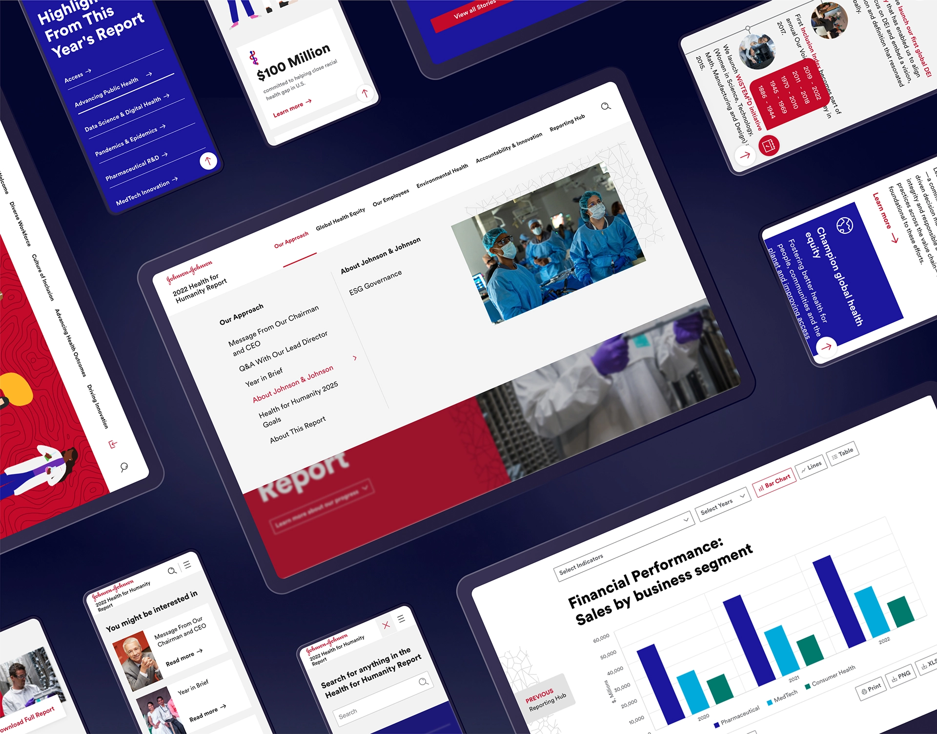
Vivid animations, dynamic charts and a coherent appealing design invite stakeholders to get informed about Johnson & Johnson’s progress and performance in environmental, social and governance matters. The Health for Humanity Report and the Diversity, Equity & Inclusion Impact Review inspire more than 153,000 employees of Johnson & Johnson and their partners to achieve their Health for Humanity 2025 Goals.
Johnson & Johnson requires highest standards in responsiveness, usability, accessibility, and compliance with their Design guidelines. Based on Johnson & Johnson’s previous reports, nexxar created a media-specific design concept that follows visual trends, delivers a great experience to users and readers and delivers on accessibility standards. Making use of the unique opportunities of online reporting, the content is presented in an aesthetic and dynamic way.
-
Process
-
Services we provide
- Consulting
- Design concept
- Programming
- Motion design
-
Features
- Key figures comparison
- Interactive charts
- Animated illustrations
- Special pages introducing the leadership
- Dynamic milestones
- Glossary
- Filterable story archive
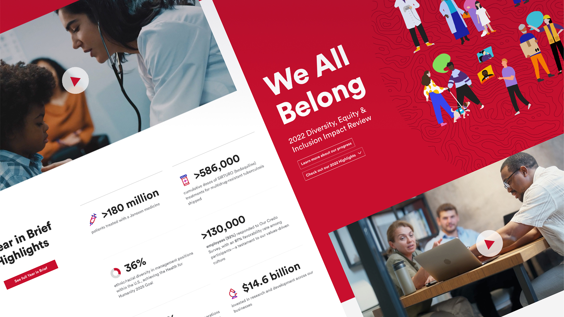
Dynamic illustrations
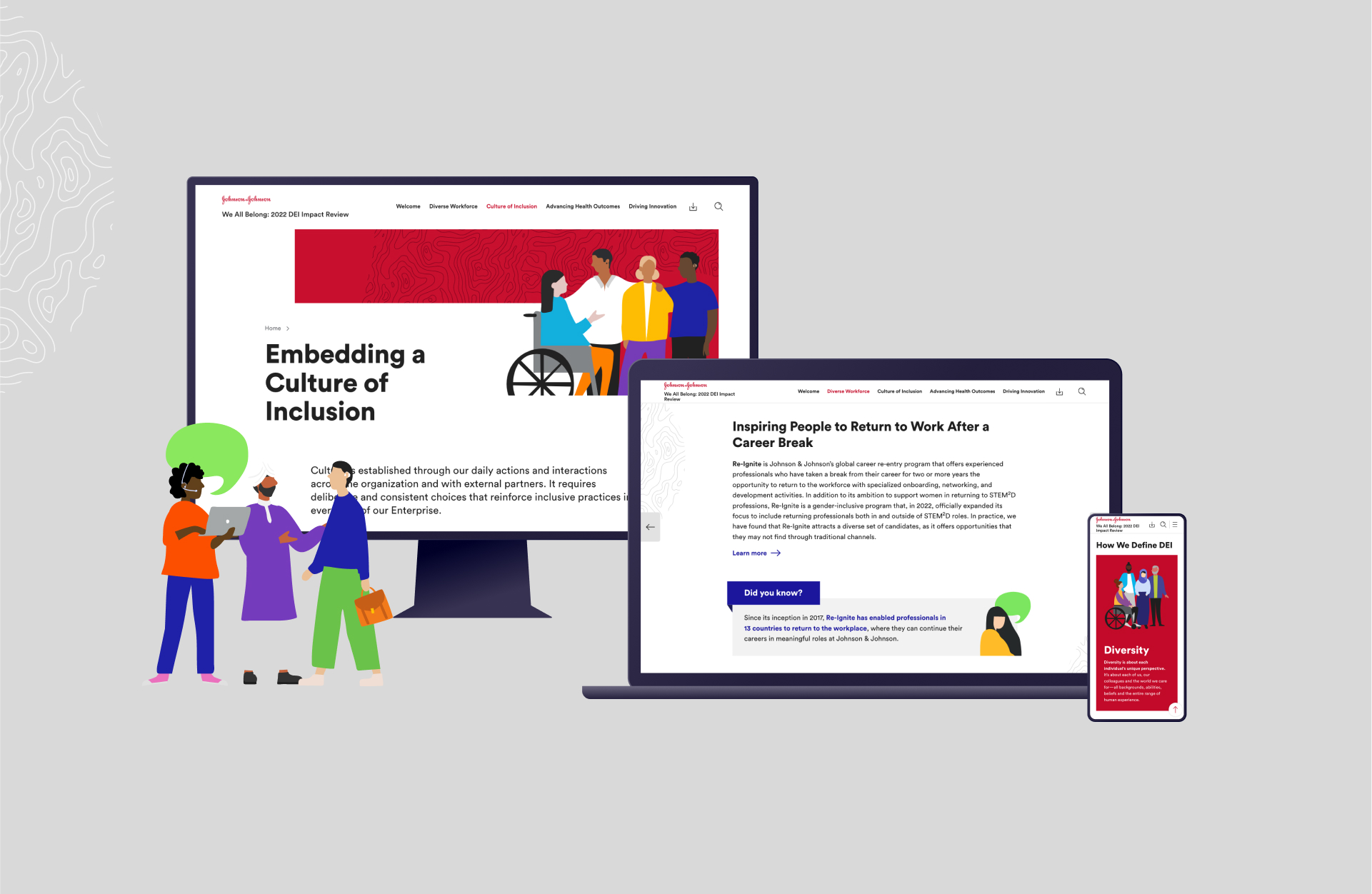
Starting with the landing page, nexxar added motion to the various illustrations of humans in the Diversity, Equity & Inclusion Impact Review. The dynamic illustrations attract the attention of users and readers.


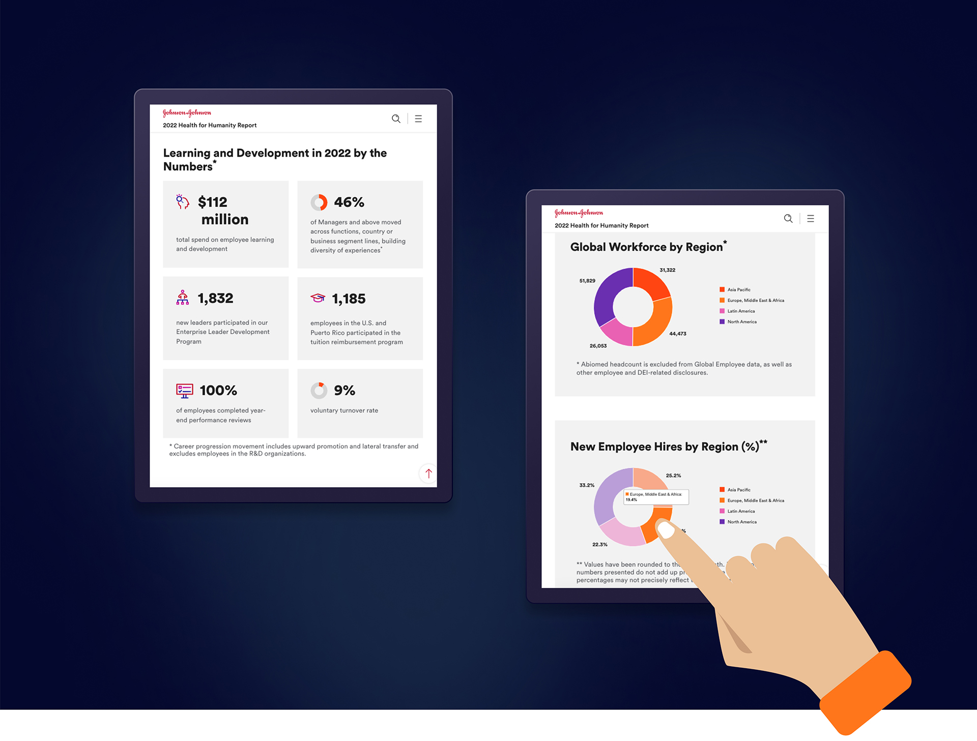
Animated icons and pie charts
Drawing attention to key figures, the number count-ups, icons and pie charts load when entering the viewport.


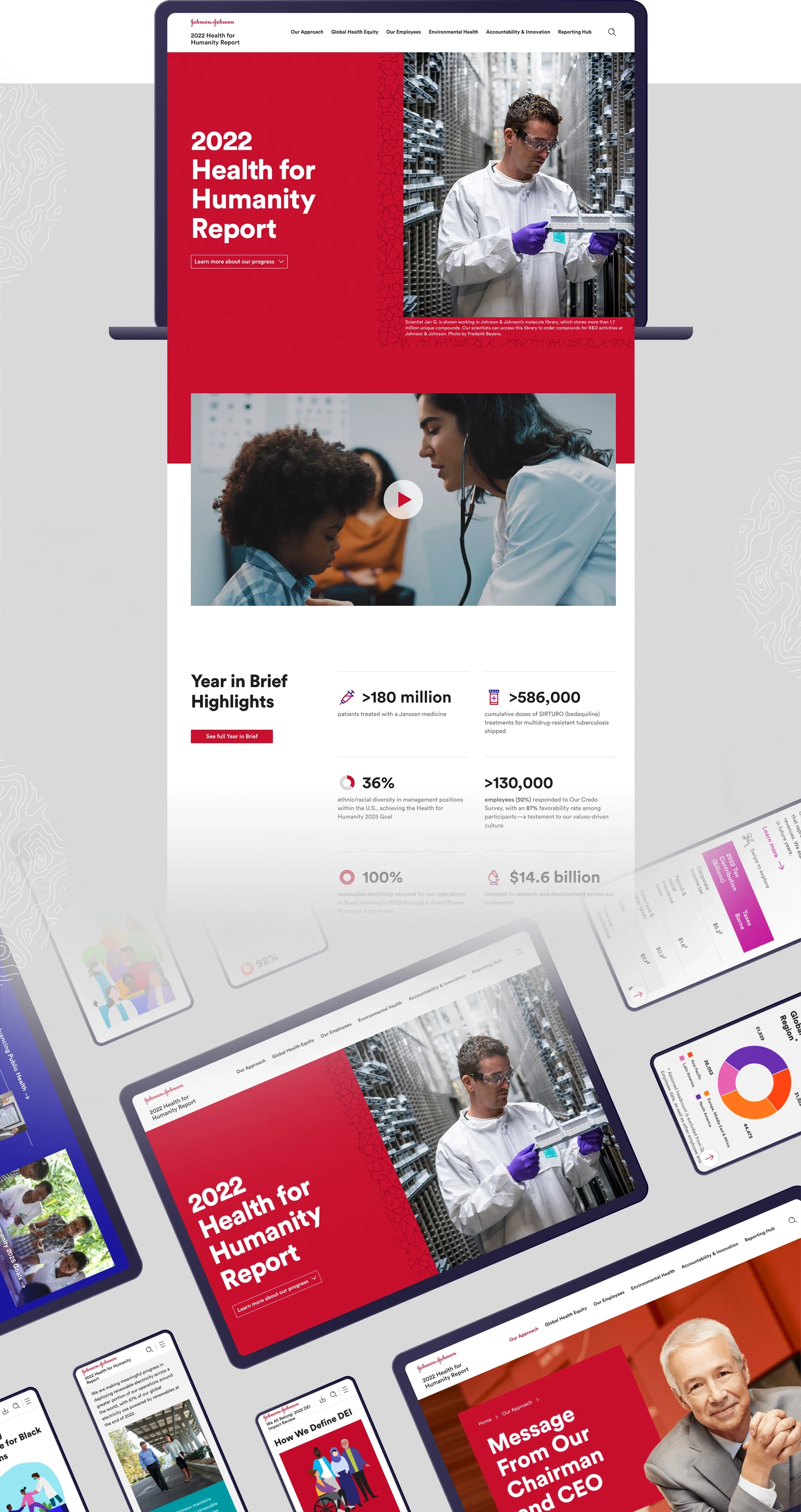
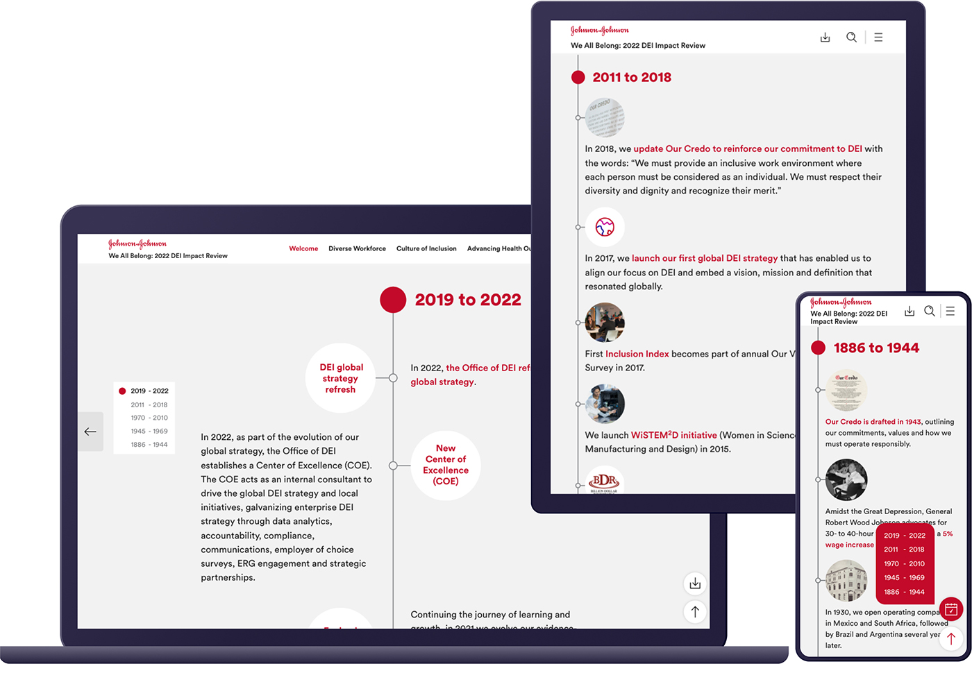
Made for every device
A visually appealing way of displaying content needs to work well, regardless of the screen size in use. The milestones page tells the story how Diversity, Equity and Inclusion has shaped Johnson & Johnson’s story, and it dynamically adjusts to the space available on your screen.
Easy navigation
Many paths lead you to your destination: A clear main menu, the search-as-you-type search function, a section of relevant “You might be interested in” pages at the end of each page or the icon-navigation at the side, leading directly to the downloads page, the key figures comparison or scrolling back to the top of the page. While on the page, on the left and right you’ll find “previous” and “next” buttons, which expand on hover displaying the title of the respective pages. Links in the text are clearly visualized with an info-icon or a “Learn more”-arrow. All of these elements help the users to find navigation in your corporate report as easy as navigation through an airport or hospital.